The Incredible Debut of Computer Mapping: the Chicago Area Transportation Study (1959) & the Atlas of the British Flora (1962)

In the 1960s, punched cards and tabulation machines had already been in use for several decades. They were first employed at scale for the United States census in 1890, using Hollerith tabulating machines—a technology that laid the foundations for what would become IBM. Over time, these systems became standard tools for public services and scientific institutions conducting large-scale surveys and studies across the globe.
By the mid-20th century, punched card systems were widely adopted: in the United States and Canada, largely through IBM; in the United Kingdom, via Powers-Samas; in France, where Bull machines were used both for censuses and, notably, to help organize the French Resistance during World War II; in Italy, through local and IBM-affiliated systems; in Germany, where HMG (Dehomag) technology was tragically used to support the logistics of the Holocaust; and in postwar Japan, with Toshiba and later Fujitsu leading adoption for government planning and industry.
In the 1960s, maps and other data visualizations were still largely produced manually, even if the data itself had been processed by machines. It took several decades after the first automated American census before machines began to generate maps and graphics themselves—often using line printers and specialized devices like the now-forgotten Cartographatron.
Keep in mind: computing power was scarce and expensive at the time. “Computer time” came at a premium—this was an era when computers filled entire rooms, required several human operators, and consumed enormous amounts of electricity.
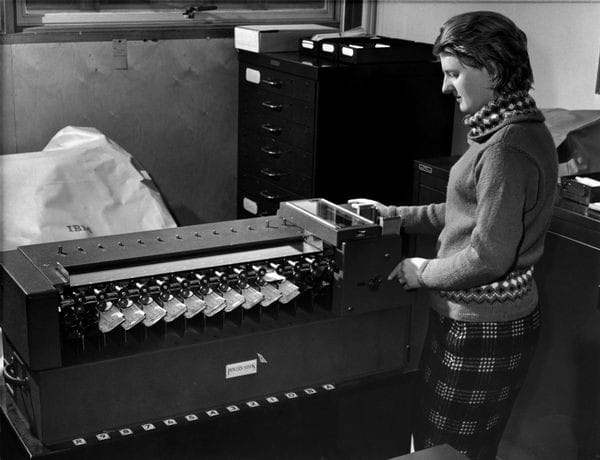
Punched cards and their mechatronic companions had evolved since Hollerith’s era—80-column cards were eventually replaced by more compact 40-column cards—but the process remained labor-intensive. From data entry (punching each card by hand), to processing, storage, and transferring data to magnetic tape or printers, it was still a logistical feat.
Only large-scale, publicly funded projects had the resources to access such computing infrastructure. These efforts aligned with governments’ growing interest in understanding populations, mobility, transportation, land use, and natural inventories. These were the early days of modernity: rapid urbanization and suburban expansion, the rise of the car in the United States, and massive infrastructure projects reshaping land and transport systems.
The first instances where machines were used not only to store and process data, but also to draw maps and visual graphics, include:
- 1950 – mapping data from the most recent U.S. census
- 1959 – the Chicago Area Transportation Study (CATS), the first project of its kind to document metropolitan mobility patterns with machine-generated visuals
- 1962 – the Atlas of the British Flora, one of the first computer-assisted scientific mapping projects
- 1963 – the Canadian Land Inventory (CLI), which produced thousands of land-use maps from punched-card–encoded data
- 1965 – the founding of the Harvard Laboratory for Computer Graphics and Spatial Analysis, which turned computer-aided geographic visualization into a field of its own and laid the foundation for GIS (Geographic Information Systems). The lab invented the SYMAP system at the end of the 1960s, allowing to produce a great diversity of map designs from punched cards.
Let's dive for now into two of one of the first, and most ambitious projects in the world that used machines to produce maps.
The CATS survey (1959)
One of the first massive punched-card based project at the time was the Chicago Area Transportation Study (CATS) initiated in the mid-1950s. That study involved the collection and processing of enormous amounts of data about car traffic, land use, population mobility, travel patterns, etc.
Survey responses and observational data were transcribed onto punched cards. The information from the punched cards was then transferred to magnetic tape. During this conversion, the engineers performed additional computations, including the calculation of trip lengths and directions. Then, they used the processed data on magnetic tapes to generate visual representations of travel patterns.
A notable tool in this process was the Cartographatron, an early automated mapping device. It read the magnetic tapes and produced graphical displays of trip data, such as desire line maps, which illustrated the volume and direction of travel between different zones.
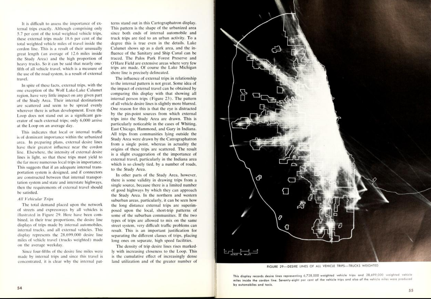
"Named the Cartographatron—or Cat’s Eye for those who found the more scholarly term too hard to remember —this machine was capable of automatically drawing and displaying, on a cathode-ray tube, the desire lines of residents in the Chicago metropolitan area, as revealed by the 1956 Home Interview survey, in which 49,591 households were interviewed.
Given the sheer number of desire lines to be drawn, a computer program was initially considered to automate the process. However, this solution was rejected, as it was deemed too time-consuming and too costly in terms of computer time—a rare and expensive resource at the time, with an estimated cost of around $60 per hour (roughly $515 today) on a Burroughs Datatron model.
The Cartographatron was delivered to the CATS offices in February 1958. Its design and construction took more than two years of work and cost $68,500. The machine was used for the first time in August 1958, and by the end of 1960, it had produced 'some 200 displays of trip desire lines and trip ends (dot patterns) from Chicago data'. The total cost of the operation was $133,420, including $18,500 in wages for the machine’s operator. Despite the considerable cost, the CATS officials seemed satisfied with the machine’s performance. It was later also used by the Pittsburgh Area Transportation Study and the Federal Aviation Agency."
Source: Chatzis, K. (2018). Capter et Cartographier les Pratiques et Désirs des Américains En Matière de Mobilité Urbaine (de L’entre-Deux-Guerres Aux Années 1960) Flux, 111-112(1), 57-79. https://doi.org/10.3917/flux1.111.0057 (my translation).
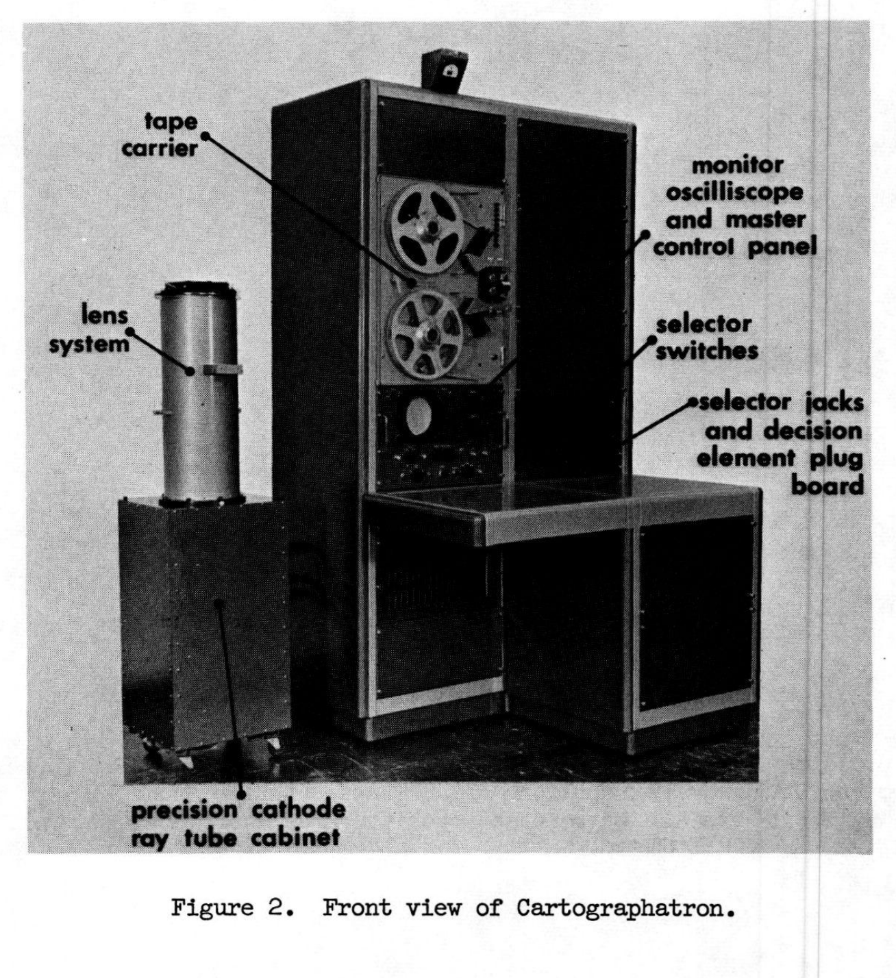
The full details about the machine, how it operated and how it produced the maps are given in a paper called: "Interpretation of Desire Line Charts Made on a Cartographatron", by J. Douglas Carroll, JR. and Garred P. Jones.
The process had more to do with analog photography than printing: the data from the magnetic tapes were used by the machine to produce precisely positioned rays of light, that produced a negative, which was then used to make high contrast black and white images using analog photography techniques.
Hence, the very particular graphic style of those early machine-made maps in the CATS, and the unique nature of this machine that mixes data, electronics and analog photography together.
The Atlas of the British Flora (1962)
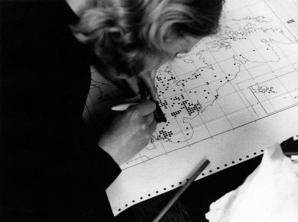
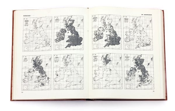
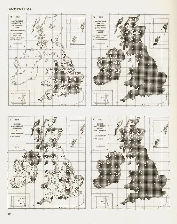
The Atlas of the British Flora, published in 1962, marked a turning point in both botanical science and data handling. What made it truly unique was not just the scale of its scientific ambition, but the rigor of its methodology.
It was the first comprehensive, systematic attempt to map the distribution of every vascular plant species across Britain and Ireland, using a strict 10-kilometre grid square system. This grid-based approach allowed for consistent, replicable observations and a level of precision previously unseen in botanical surveys. Over 2,000 volunteers—many amateur naturalists—contributed to the effort, embodying a remarkably democratic and decentralized scientific project.
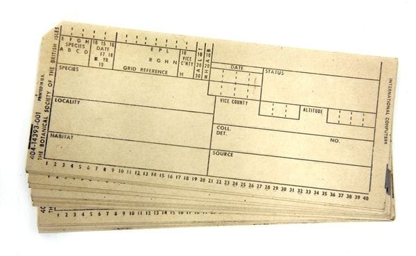
But the Atlas was just as groundbreaking for how it handled the data as for the data itself. For the first time in such a large-scale ecological survey, computers were used to process and analyze the findings. The data collected in the field was encoded onto punched cards—a standard medium for data input in early computing—and fed into an electronic computer. This allowed for efficient handling of what would otherwise have been an overwhelmingly vast amount of information, including over a million individual plant records.
Computer pioneer Maurice Wilkes helped design a system to make all the collected information accessible by printing the data as dots on a map, showing the distribution of various species.
In an age when technology seems to get outdated before it gets dusty, the longevity of the punched card system created to catalogue Britain’s ecosystems is remarkable. Researchers used the sturdy system for 20 years, recording butterflies and other species. In 1970, the collected information was transferred to magnetic tape. - CHM.
It’s something worth remembering, especially as we watch—many of us horrified—the erasure of vast amounts of scientific data, the dismantling of research institutions, and the dismissal of scientists under the Trump's administration. I hope we can stay anchored in the knowledge of what it once took to get here, honor the brilliant minds who paved the way, and prepare ourselves to rebuild and reinvent if we must.